Institutional Website

Medical Website Redesign

About the project

The challenge

The previous site held valuable medical information, but presented it in a dense, unstructured way. Specialties, credentials, and contact details all lived within long blocks of text, forcing patients to work harder than they should to understand whether this was the right doctor for their case. This kind of disorganization carries a specific cost in healthcare: a patient who can't quickly find what they're looking for doesn't just leave the site — they lose trust in the doctor before ever meeting them. The lack of a biography to establish credibility, combined with no clear path to contact, made that problem worse, leaving potential patients without an obvious next step toward booking a consultation.

The solution

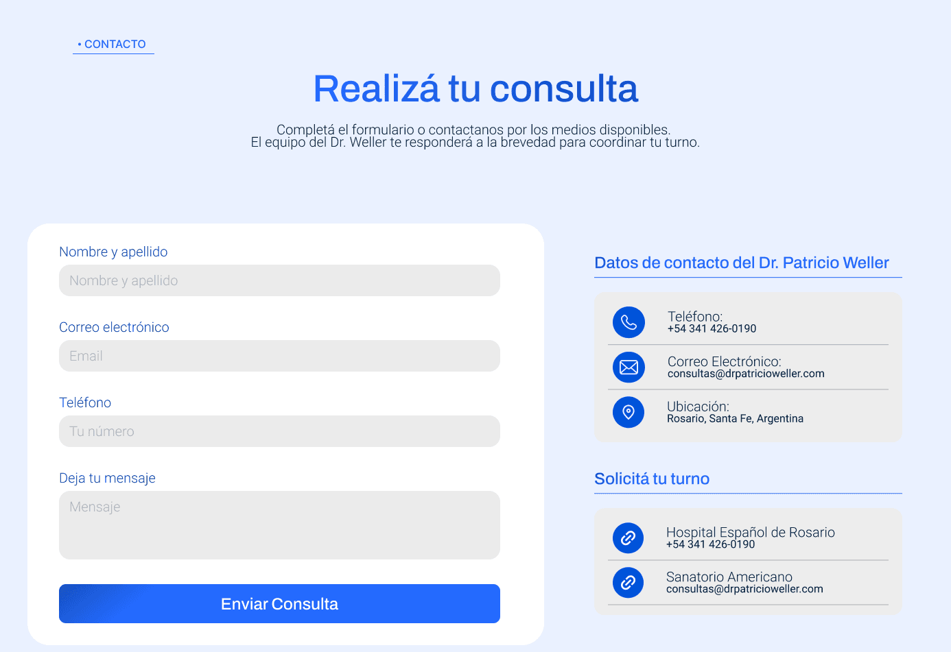
The redesign started from a simple premise: clarity reduces anxiety, and reduced anxiety makes booking a consultation easier. Information was reorganized around what the patient needs to know first — specialty, experience, how to get in touch — ahead of technical detail, which remained available but no longer stood between the patient and that first decision. Specialty-specific cards were designed so visitors can identify in seconds whether their concern is covered. The biography was restructured to project authority and experience directly, without unnecessary detail that doesn't support the patient's decision. Every piece of interface copy — from headings to button labels — was written to guide the visitor toward one clear action: reaching out with confidence.

AUTHORITY

Biography designed to project medical credibility and experience.

ONE CLEAR PATH

Un único camino claro hacia la consulta.

SPECIALTIES

Card-based navigation organized by reason for consultation.

Project Shoots

Te muestro un poco del resultado final de la solución planteada y llevada a cabo para este proyecto

Create a free website with Framer, the website builder loved by startups, designers and agencies.